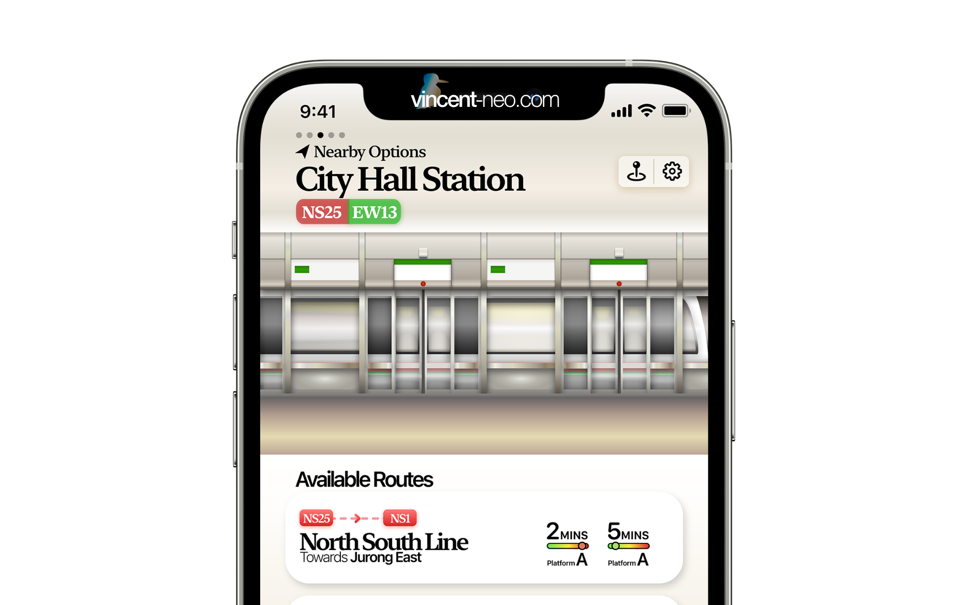
App Concept: Design-focused all-rounder transport app companion
24 November 2020
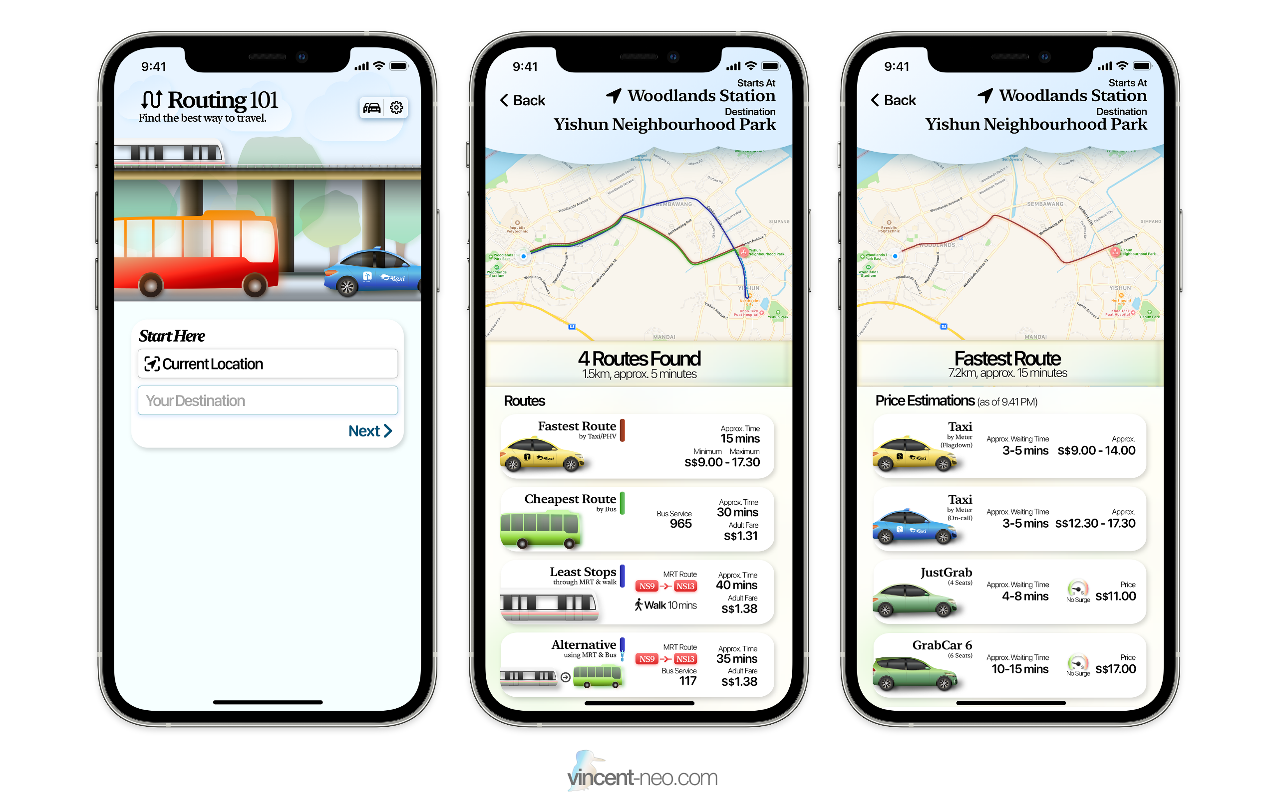
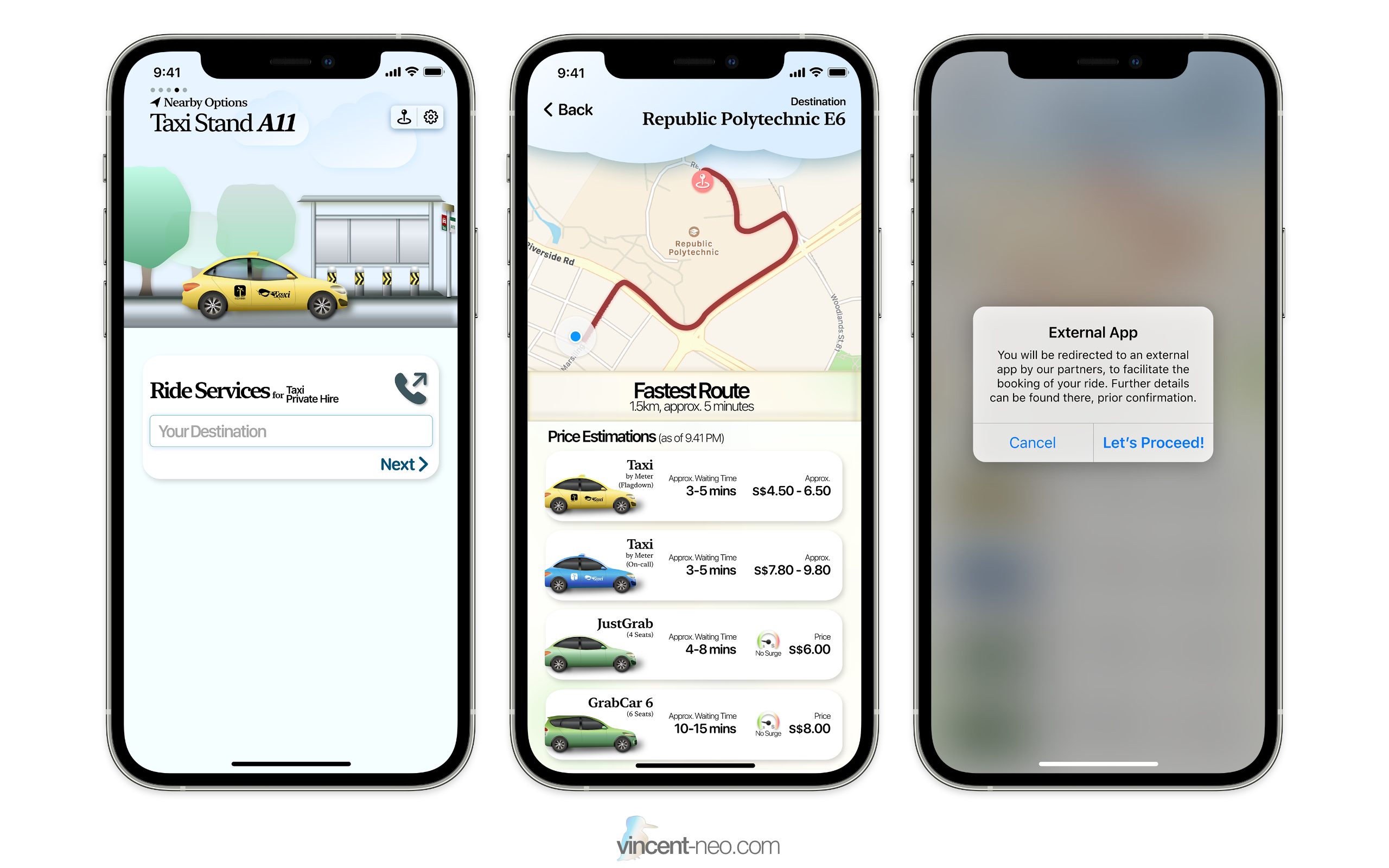
Personally, I love great design. For even an everyday app, I would think of how one could design it in a different way, and this is something that I would like to do in this app concept. Other than design, I tried to add a few more functionalities, so as to enable it as a more "all-rounder" transport app, than just a bus app. This app embodies a few things: you get bus timings and route information, MRT/LRT timings and route information, taxi and private hire price comparisons, along with routing suggestions as an idea to bring users to their destination, through the best suitable public transport method, either by speed, price, or a combination of the two.
The idea of the all-roundedness was to make the app less ordinary. Public transport comes in many forms, and many of us takes a combination of a few of these transport types, depending on multiple variables, such as price, weather, the need to reach a place in a specific time, and more. Why juggle between apps, when you can have it in one app?
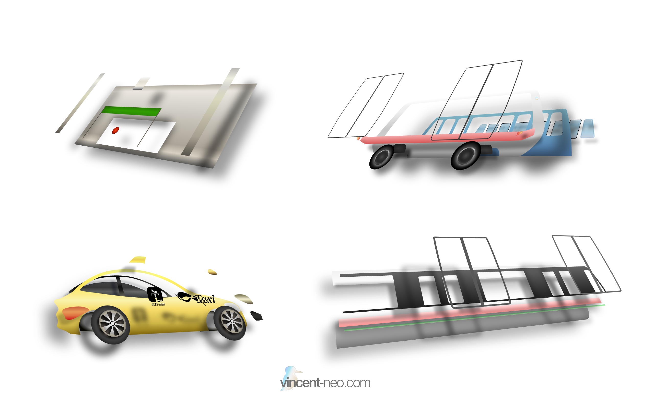
I was inspired by the neumorphism design trends going around the internet. My design is not entirely neumorphism, as it appears to me that, to be truly conforming to the trend, I may have to abandon too much colours, and instead go with a white/black overalls, with some colour accents. However, heavy use of shadows, light glow effects and beautifully smooth gradients are something that I borrowed from the trend.
To put it simply, the design concept of the app was, for people like me, people that love to see the use of design elements in an app to represent real world content. People that want to see design trends infused in new ways. It's like the concept of reimagining yet another beautiful weather app. While we need to only see the forecast data most of the time, don't you think the additions of the nice backgrounds and animations make using the app much more... better?
Existing problem & solution
Currently, we have multiple bus apps on the various app stores, all getting the same data from the LTA DataMall, along with other API sources for the different needs. The thing that sets these apps apart, are usually:
- the way the app presents the data.
- missing features of some apps that others have.
The problem is that, while these apps serve their purpose well, I personally find that if we could combine a few more transport options in, along with bringing in the magic of design, to make a boring app, less boring, will make the experience better.
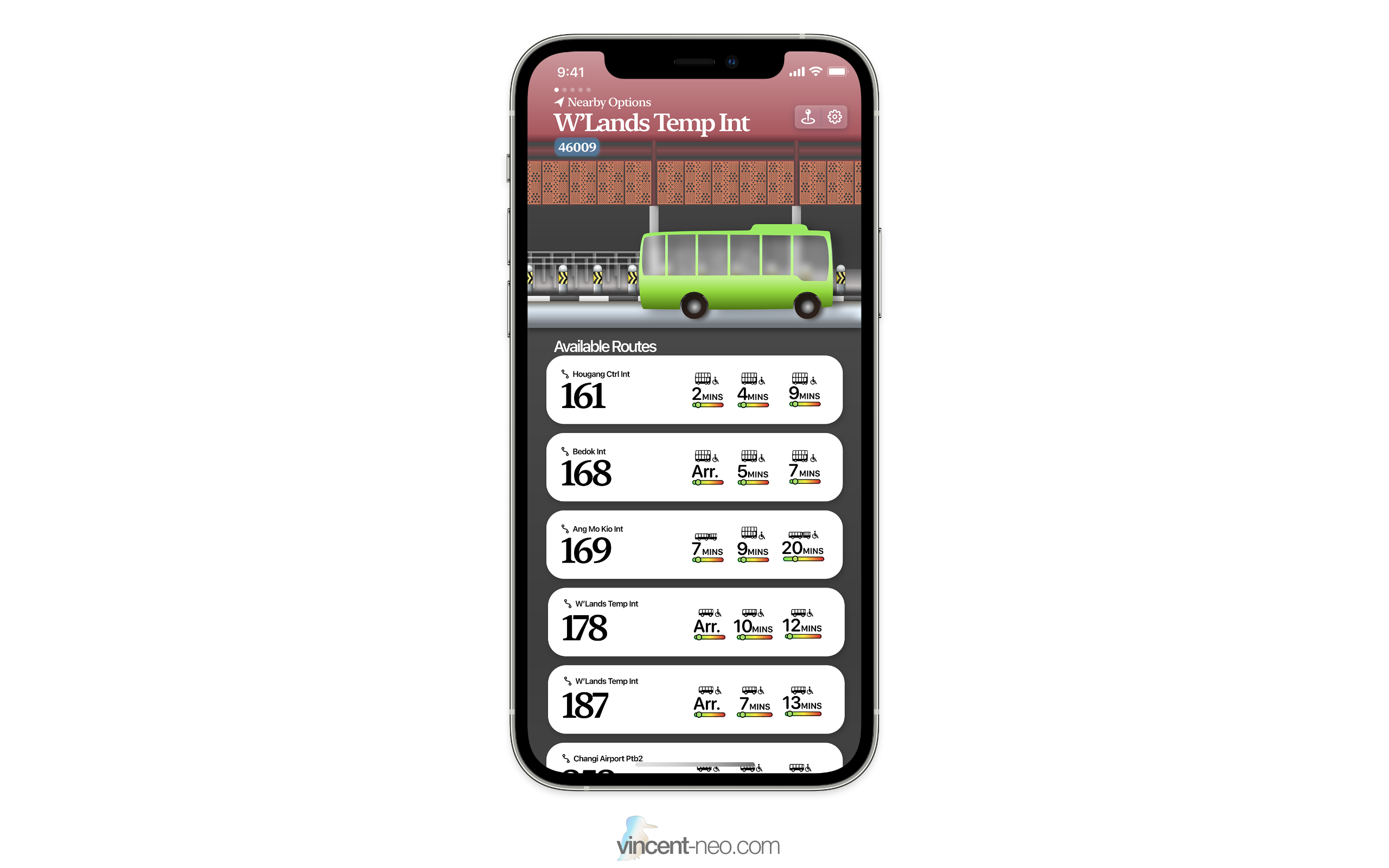
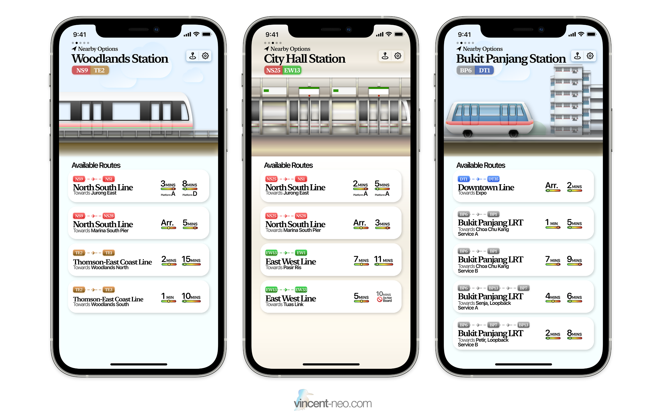
My idea of this transport app, is to mainly focus on where you are at currently, and to communicate to you on what are your choices, to proceed on your journey. You can choose it manually, to use it like an ordinary bus app, but also to use it as a routing app. I wanted to invoke calmness through the specially designed top view, which houses a representation of the current transport method that you have selected.
Analysis
Let's look at some of the current apps that we have (look: I respect all of you with your hard work, but this is a requirement set out by my polytechnic to compare my work with your apps. Apologies here, if you ever read this!)
SMRTConnect
by SMRT Corporation Ltd
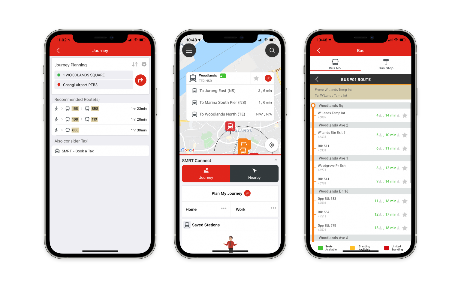
Some screenshots of the app
This is a first-party application created by SMRT themselves, to show users MRT and bus arrival times for services operated by SMRT.
Strengths
- It is quite an all-rounder app. It supports journey planning, MRT timings, which is already something that is lacking in some other apps.
- First-party app, so it will probably receive newest information, the fastest, such as new MRT lines are bound to be added in this app first.
- Ad-free.
Weakness
- I personally find it crashes a lot. I can have it crash multiple times at different places of the app, randomly.
- The UI feels slightly dated.
- Does not tell you the bus type (whether its single, double or bendy types)
- Random UI design quirks.
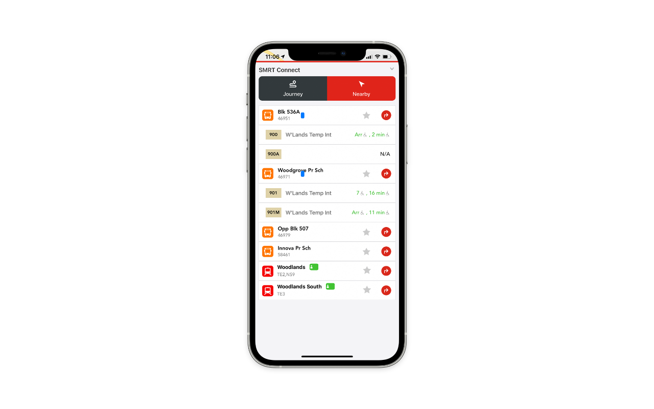
Unsure what the blue dots are supposed to mean?
Opportunities
- Aim for app stability
- Better design
- Include bus arrival times of other public transport companies like SBS Transit or Go-Ahead
Threat
- A large corporation has the capability to update their app at a faster and better rate should they allocate the budget to do so.
Singabus
by Cotton.sg Pte. Ltd.
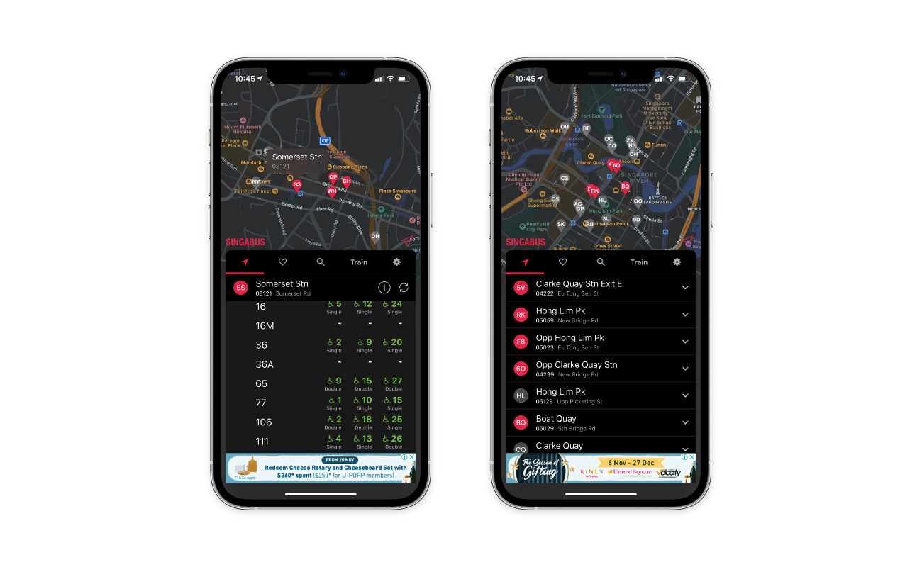
Some screenshots of the app
This a simple, no-frills bus arrival timings app created by a third-party developer. It is relatively popular, as its free and relative stability attracted many users.
Strengths
- Simple, easy to use.
- Rather quick at getting latest timings.
- Map UI rather useful in quickly choosing nearby bus stops.
- Contains arrival data for all public bus operators.
- Tells you the size of the next bus, unlike SMRTConnect.
Weakness
- No MRT timing support.
- Sometimes can get confused over the UI.
- Does not support route planning features.
Opportunities
- Include MRT timings and route planning features.
- Try to reduce confusion.
Threat
- Simplicity is also something that many would prefer, and some with rather have a simple and lightweight app, then one with fanciful colours and design.
My App Concept functionalities
Now that we have briefly looked at some of the current options, let’s look at what I am conceptualizing.
Functions
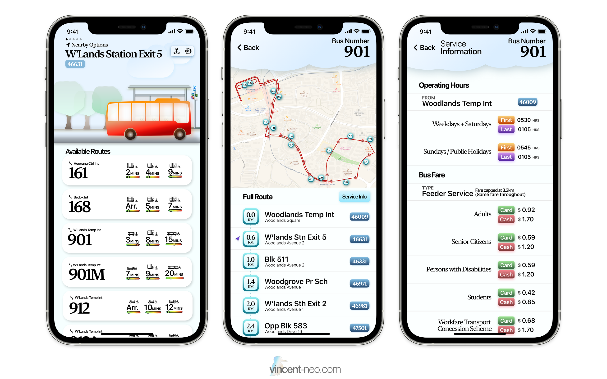
- MRT/LRT Arrival Timings
- Bus Arrival Timings
- Route planning features
- Taxi and private-hire price comparisons
- Bus, MRT and LRT load (whether if its full or not, an estimate)
- Information such as fare details, last bus, etc.
- Full route can be shown.
Images
Conclusion
I wish to inspire you with my design and concept of my transport app, and I truly hope you enjoy my design.