Environment Development Log
1 June 2021
Singapore weather is sometimes like this: sunny right now, then it’s starts to drizzle the next minute, followed by a sudden shower.
With that, its always nice to have a weather app at hand, preferably one that uses data from our local agencies, such as the NEA.
I always check the weather before embarking on an outdoor activity such as birdwatching in the parks, and I have always enjoyed a good, fast, and easy weather app, especially if it has a rain map.
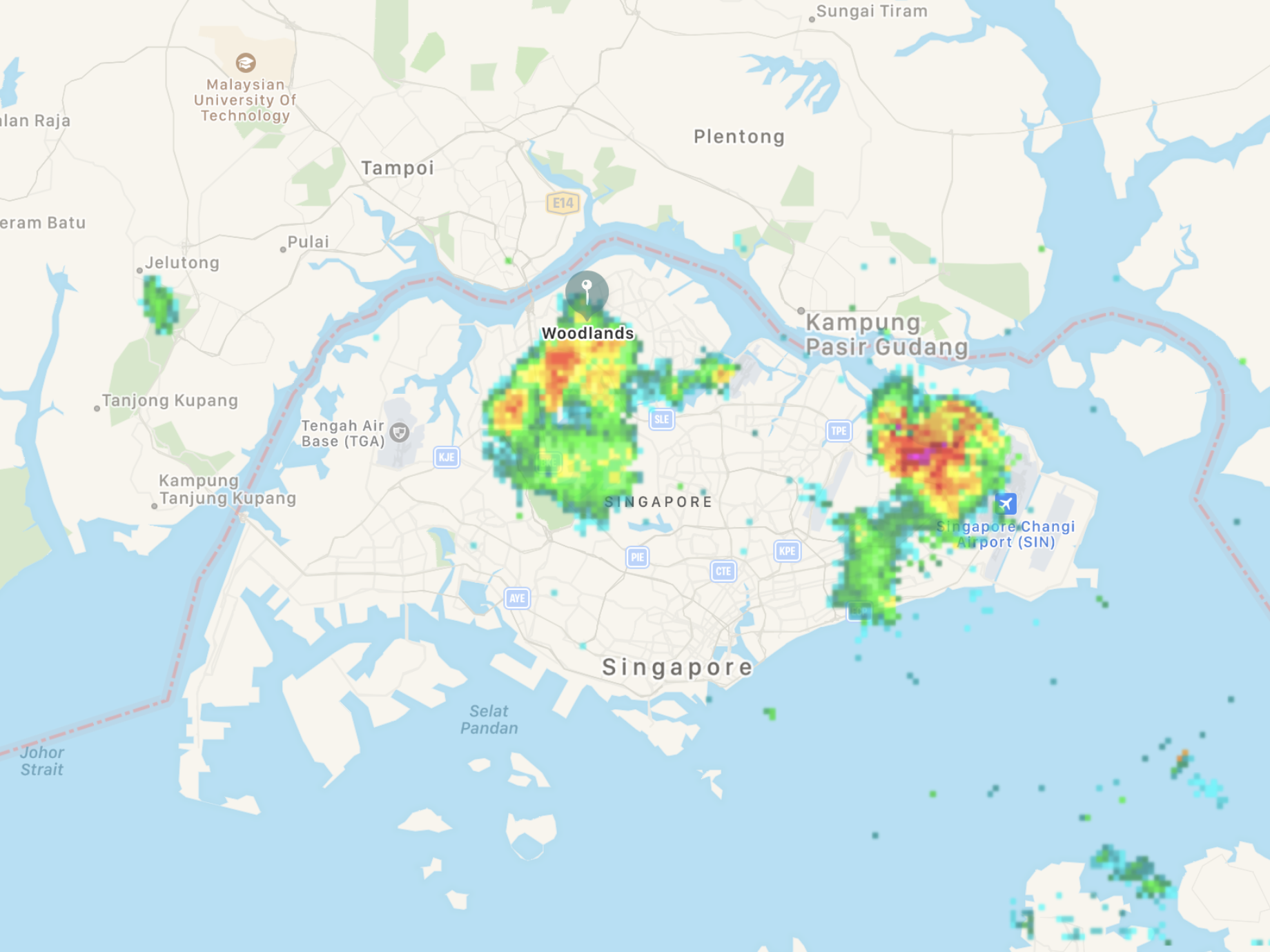
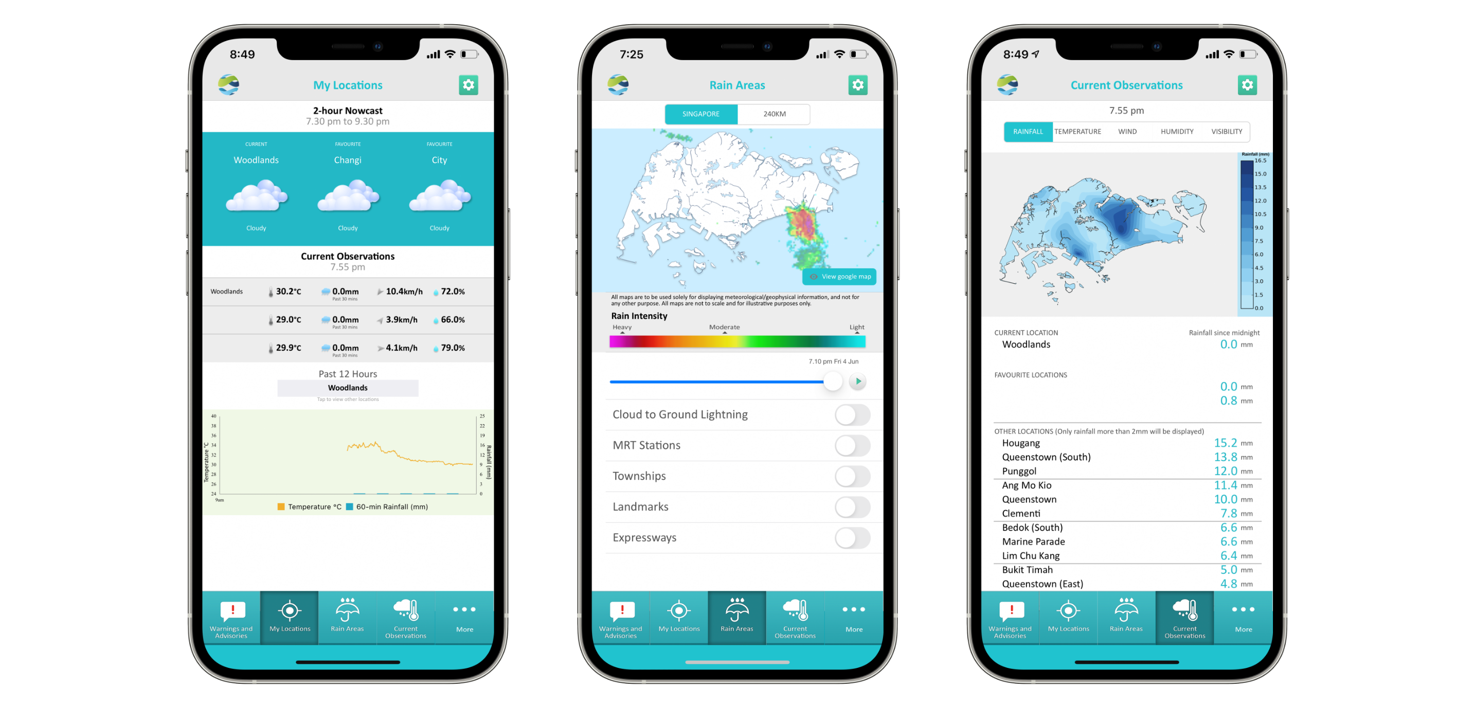
You know, I was referring to that colourful map overlay that measures intensity of rain, as well as the area that it currently covers.
That, along with other info, such as air quality, UV, temperatures and humidity, along with a forecast, is usually more than enough information to get by.
The truth is, a lot of apps tick the above criteria. Weather apps are aplenty. Why would I want to make another one? That comes from the fact that, most weather apps do not directly get data from a local weather agency, and that I see chances of improvement in apps that do.
The aim: convenience and comfort.
Issue
I find that one of the best things to do on the Apple Watch, is to use the apps on the watch to quickly get information. Some of this include getting the bus arrival times on the watch, which is rather filled, since there are a couple of watch apps that cater to that, already available. Weather apps, especially one that uses local data, and caters to those who wants a rain map, seems scarce, if not, non-existent.
Another issue is that, some apps, although containing the needed data, wasn’t as easy to glance over and get the information I want to know quickly.
Solution?
I thought I could attempt to do up a weather app, that fills the gaps. Having a fully featured Apple Watch app isn’t the easiest, but things are a lot better these days compared to the past.
In the past, Watch apps are limited a lot, due to the layout API. In the past, even maps cannot be interacted, and can only exist statically. I haven’t touched Apple Watch app development because of this, for 2 years.
With SwiftUI 2 availability for the watch, things starts to be changed. Seems like more things are possible now.
The map implementation on the watch
While the API allows for a user interact-able map, I opted to disable it, due to the unusual steps that I took to enable the rain map overlay on the watch, causing issues with placement of the rain map overlay, when zoomed in.
Here’s how I did the overlay:
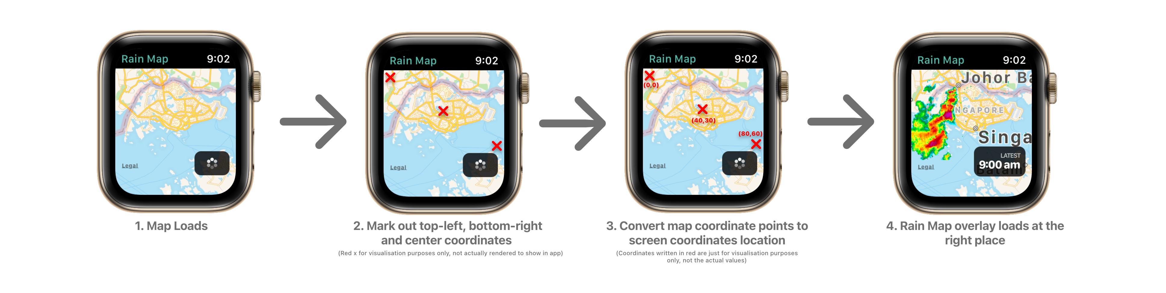
The map overlay is basically a big map annotation. To ensure that this annotation is correctly placed, and of the correct size/scale, the coordinates of the top-left, bottom right and center is very important. While that information is available online, there needs to be some adjustments and calibration to make it fit better.
In the second step, the top left and bottom right coordinates are actually tiny annotations that are invisible. By positioning these on the map, it allows for the conversion to occur later in step 3, since it technically is at that position, just that it has no content to display to the user.
In total, the center coordinates is used to position the map, while the 2 other coordinates are used for the correct scale of the map.
When zoomed in however, the map to screen coordinates conversion gets erroneous results. This happens as the top left and right points gets out of the viewable area of the map, resulting in calculation inaccuracies. Which led to the disabling of user interactions on the map.
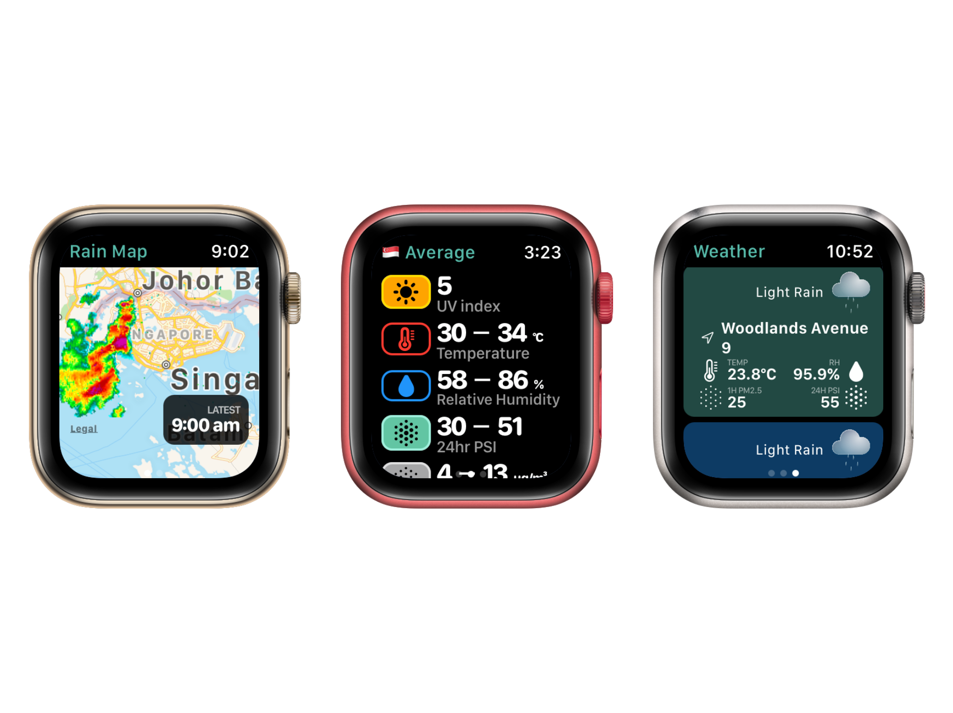
Other than the map on the watch, the watch app also features automated syncing with the phone app, where new locations can be added and synched automatically, a Singapore’s average screen, which shows the average weather conditions in Singapore.
The last screen shows a list of the synchronised location’s weather conditions, showing temperature, forecast, humidity and air quality. (UV is omitted as the UV value is applicable for the whole of Singapore, hence in the average screen.
The synchronisation is actually pretty simple, as it’s basically a passing through of some serialised data.
The phone app
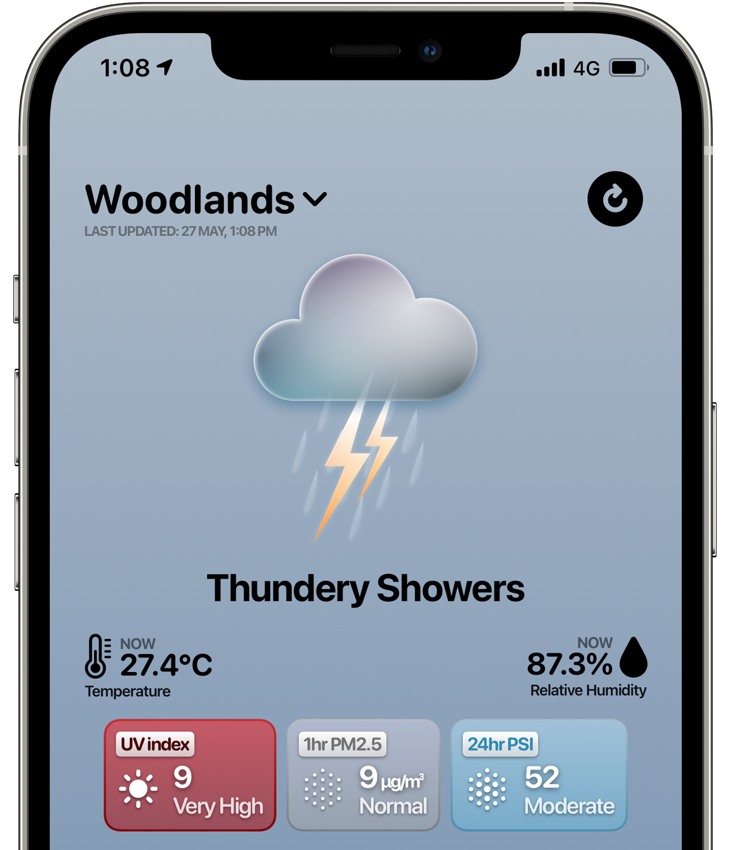
The idea of this phone app is to be glanceable. Instead of needing to ‘find’ where is the information at, my idea of Environment is to be able to let users get information quickly and easily. Want the UV values? A sun icon reminds you where to look, and the colours quickly enables us to transcribe and process as good or bad.
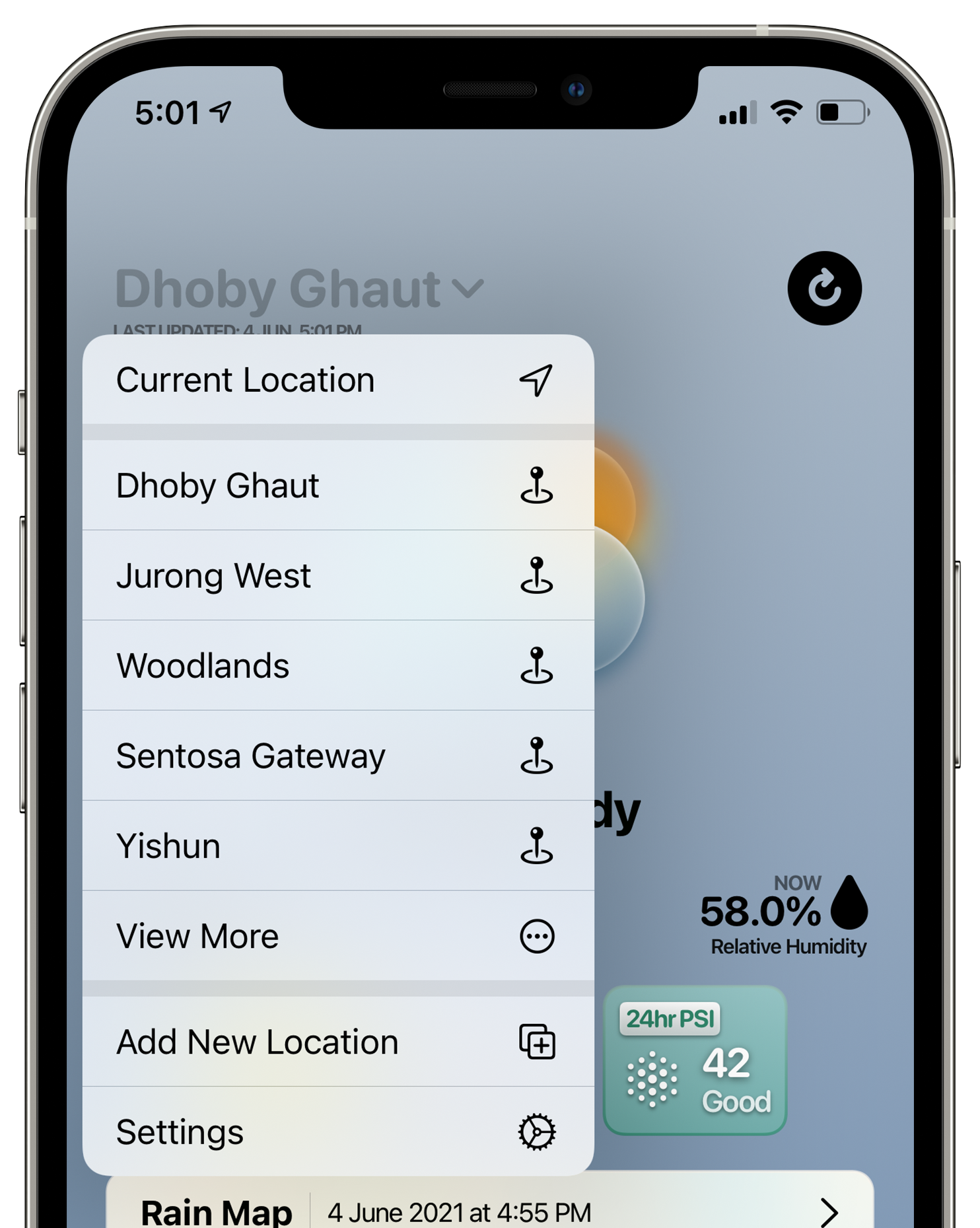
The top bar sits with a location displayed on its left, which, when a user clicks on, would see a menu pop out. From the menu, users can select another location, add a new location or visit the settings page.
The right of the top bar holds a refresh button, which, spins when the user pulls up on the scroll view. Pulling up on the scroll view is hence, also another mechanism to updating the results.
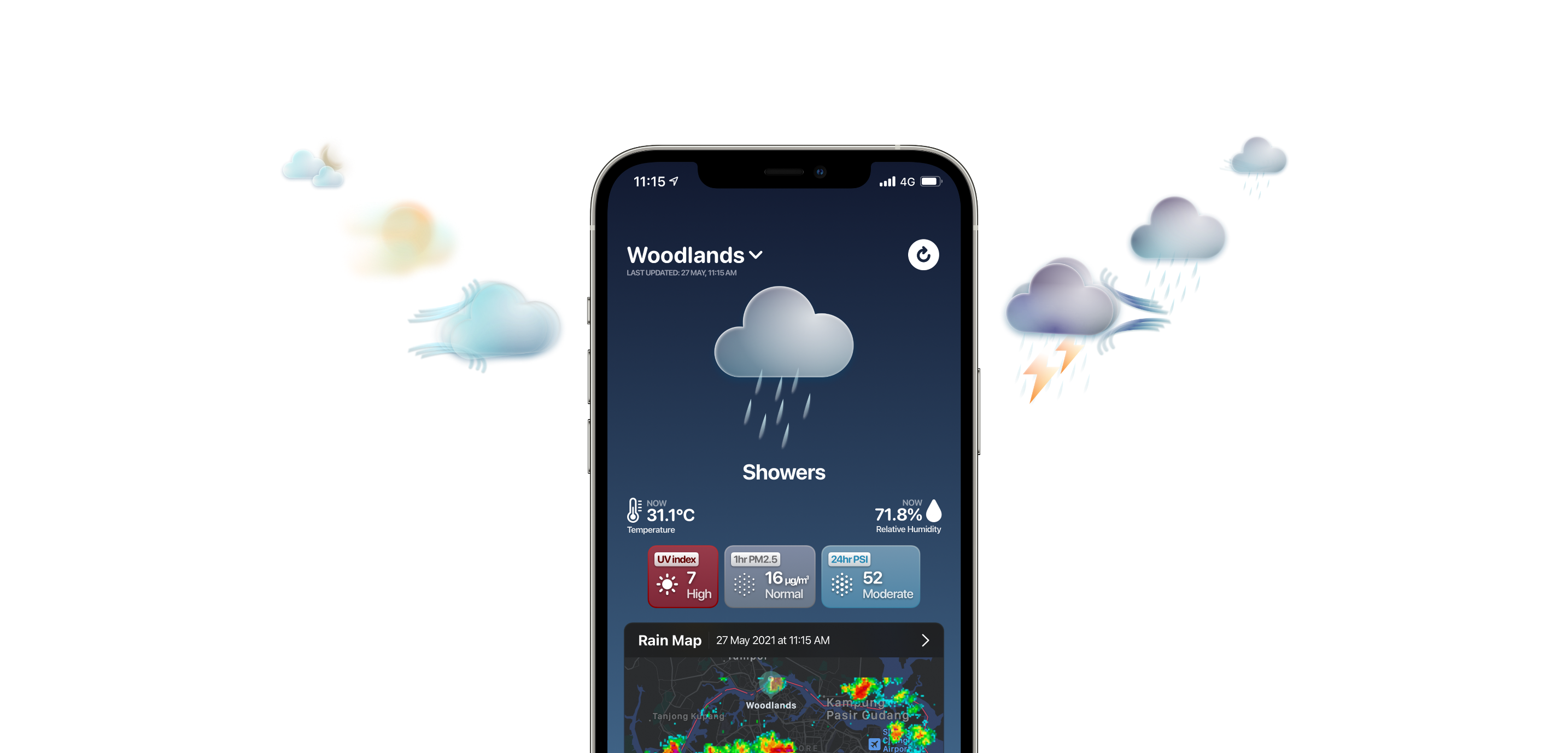
A large forecast region representing the current to next 2 hour’s weather conditions, sits on the top part of the screen, and greets users with an easy to understand visual of the weather condition. The temperatures and humidity as reported by the nearest weather station based on the selected location, sits right below the forecasts.
Do note: some screenshots were taken before the colours were finalized
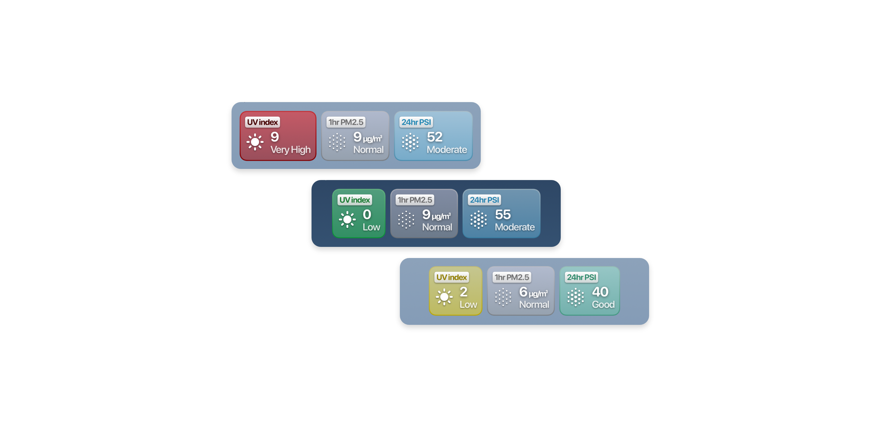
The colours of the UV and air quality indexes changes depending on the situation. I have tried to match rather closely to how the official system works too, so that users from other weather apps can find it easy to adapt. The idea of the colour coding is to facilitate the whole idea of glanceability. Quick glance over at the left-most cell, and you know roughly how good or bad the UV condition is, at present time, even before you see the numerals.
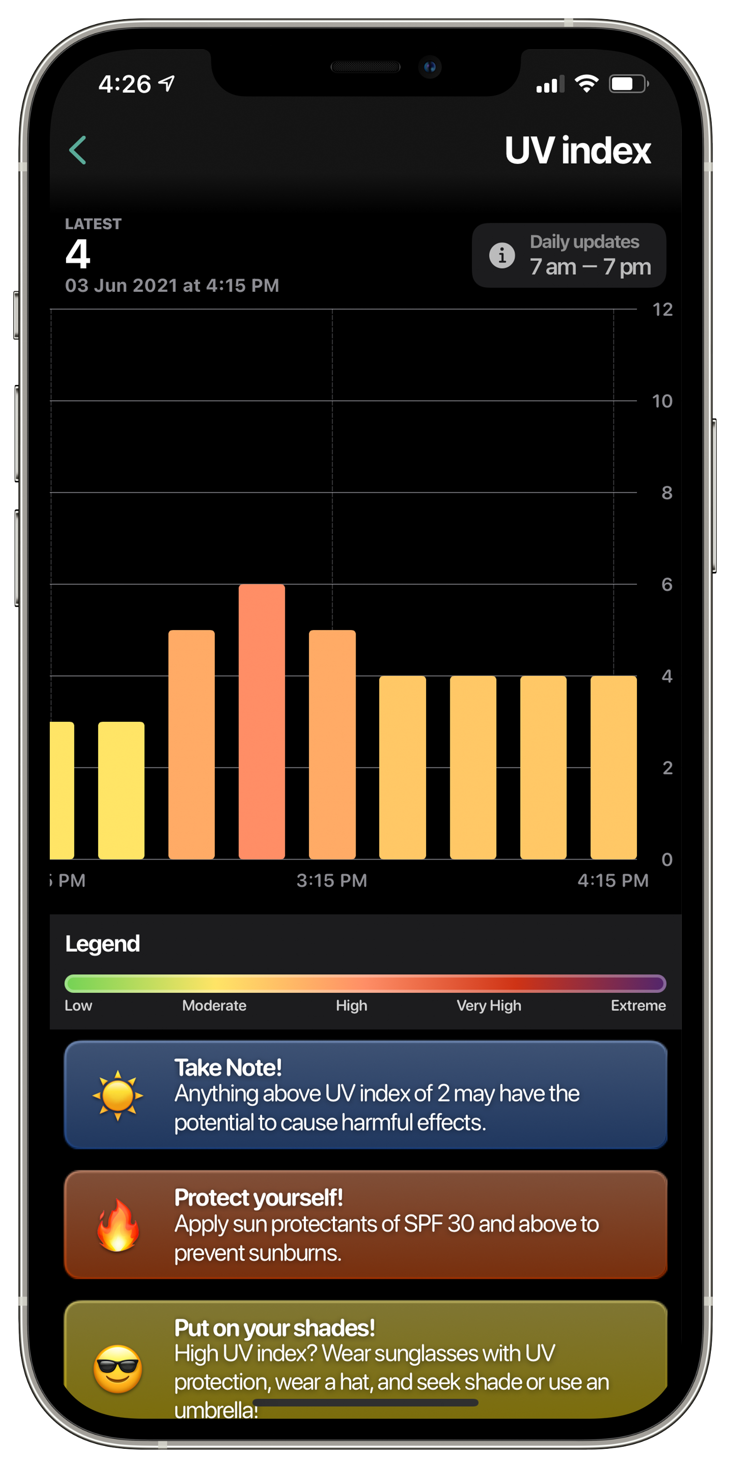
Each of these cells are clickable. Clicking them brings the user to a bar chart interface. This interface is built to be clickable and scrollable, and holds data of the entire span of 24 hours. Clicking on one of the bars will show the value of that period. Some tips are also displayed under the graph.
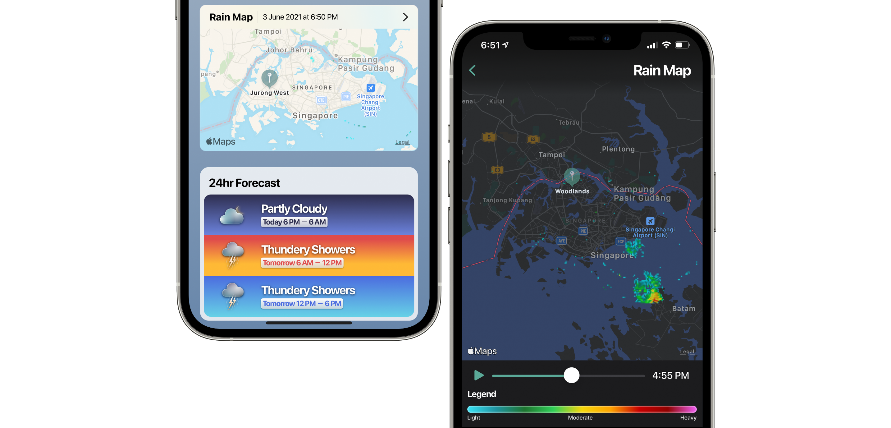
Users of the rain map can go back in time, for the past 2 hours on the watch, and 4 hours on the phone app. One can scroll through the data, or even click the play button to see the past 4 hours of rain intensity play out second by second. As every 5 minutes worth of rainfall, pass by on the app, haptics lightly taps on your hand, to represent each 5 minutes’ passings.
There is also a 24 hour forecast at the bottom of the main page, which shows the weather forecast of the next 24 hours.
The weather data all comes from only local agencies, ensuring that what the users are getting, are relevant to the local context.
Back to the aim
The aim of this project, to recap, is convenience and comfort.
Convenience in this case, meant the watch app and glanceability.
In these days of the pandemic especially, having something that you can glance at right in your watch, is often times a lot more convenient then trying to unlock your phone manually, since Face ID won’t work properly with your mask on, and the watch unlock feature of iOS 14.5 being unresponsive sometimes.
A quick click on the Digital Crown, followed by a tap of Environment’s app icon, brings you straight into the rain map.
To be able to glance quickly and get what you want to know, too, is also one important convenience factor.
Comfort. To me, comfort is brought in by design. I spent quite a sizeable amount of time, trying to make the forecast icons. From the amount of rain drops to represent rain intensity, to the positioning, how to represent wind and how to gel well with the overall look and feel of the app is one of the focus of the app.
Competitive Analysis
myENV
by the Ministry of Sustainability and the Environment of Singapore
The earlier iteration of myENV was one of my favourite locally made apps. It was a great role model for me. In fact, I still keep an iPad’s auto update turned off, so that I could use the old version.
However, the current iteration of the app, is one of the reasons that pushed me to embark on Environment.
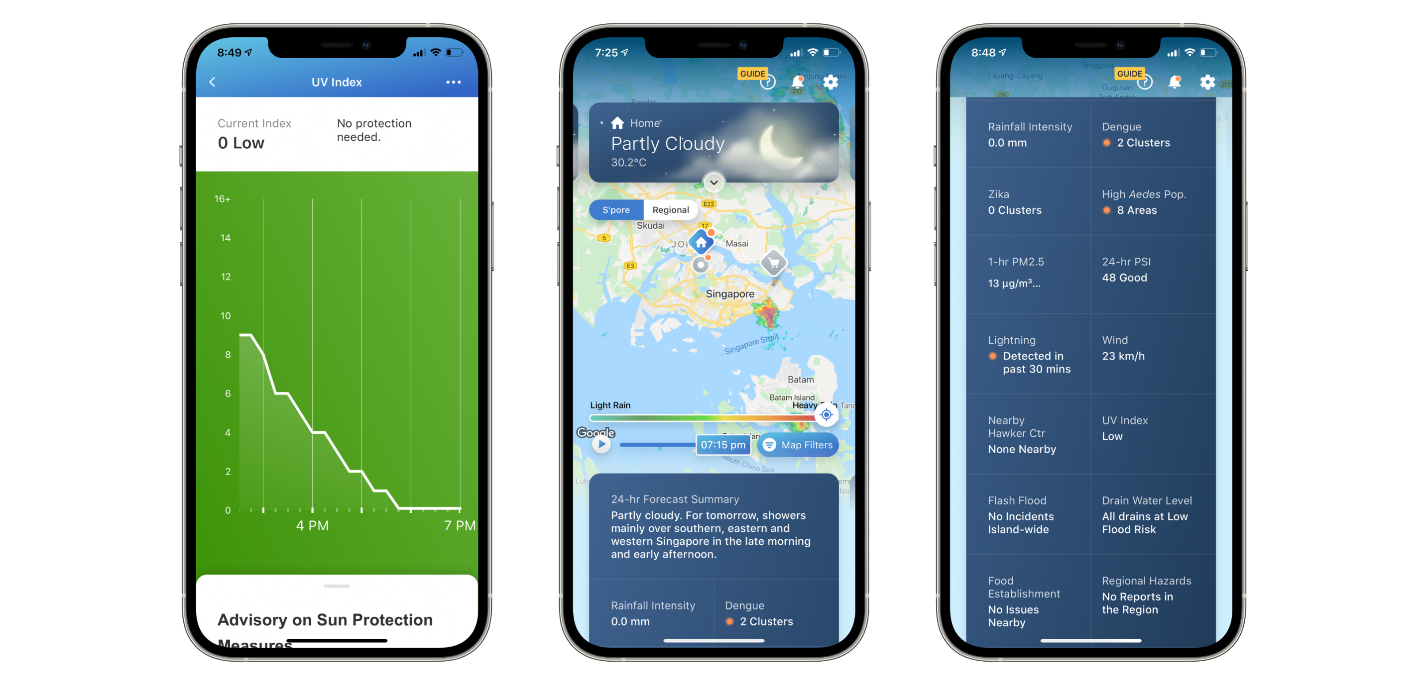
To me the current iteration lacks convenience. The absolute first version of this new iteration, won't even let a user to click on the information boxes to get into a more in-depth view, but rather needing one, to scroll all the way down to enter a more in-depth view, and then to select an item of interest.
Moreover, nothing much was colour coded, or even represented with an icon. I find it rather hard view the information I want quickly and more often then not, it requires me to read the things one by one.
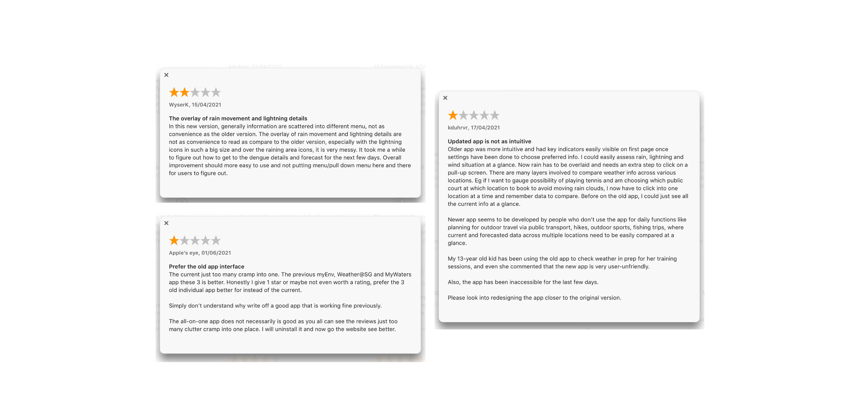
A couple of app review seem to concur with my thoughts that the older iteration was better.
This is a stark contrast to how it used to be.
It does, definitely hold more information, then what Environment has to offer, such as the Dengue informations, or the eateries informations.
Strengths
- First party app by a local agency governed by the Singapore government
- Has more data presented
- Maps offer a wider rain map
- Rain notifications issued directly from the NEA
- Direct feedback towards the agencies
- Multiplatform
Weakness
- New UI isn’t as favourable as the last
- A little laggy some times
- Information presented in the small boxes can be better (instead of showing UV index values, it simply writes as “Low” or “High”.
- Rain map’s slider can be rather hard to scroll through on smaller screens like the iPhone SE first generation or iPod touch.
Opportunity
- If the app returns to its former glory, along with its former UI and experience, it would be back on every local’s phones.
- App stability
- Easier and quicker viewing (Convenience)
Threat
- A first party app from the government will always be the most trusted unlike a third party app, even if it shares the same dataset.
Weather@SG
by Meteorological Services Singapore
This app holds a lot of extensive information, with regards to the Singapore weather. It shares a couple of things with NEA’s myENV.
The Weather@SG app is supposed to be discontinued by 14 of May 2021 and superseded by the new myENV as referred above, but appears to have been pushed back indefinitely, as no features of the app were disabled.
While it does look a little dated, Weather@SG holds the respect of many due to the extensive information it carries, such as rainfall, temperature, wind, humidity and visibility maps along with corresponding readings of seemingly all areas of Singapore.
Strengths
- First party app by a local agency governed by the Singapore government
- Has more data presented
- Rain notifications issued directly from the NEA
- Multiplatform
- Extensive information provided
Weakness
- Dated User Interface
- Lacks information on air quality, UV
- A little slow
- Discontinued status
Opportunity
- Speed
- More modern design
Threat
- The fact that it is marked as discontinued is rather sadly meaning that it isn’t much of a threat
Conclusion
As with the ever-changing weather, ever-changing needs of users, along with differing views, meant that, more is better than less.
I believe that, with the introduction of Environment, it will be relevant to many, and will serve Singaporeans, the same weather data, through another perspective and way of use.
I wish my users will feel the values that I infused into the development of Environment.
Thanks for reading!
References
Articles Referenced
Lim, C. A. (2018, June 8). Building Check Weather SG. Mr Lim Chee Aun’s Blog.
Meteorological Service Singapore. (n.d.). Weather@SG. Retrieved May 26, 2021.